The development of writing has its earliest origins tens of thousands of years ago with the inscription of simple pictures and images on cave walls.
Early Africans and Europeans left paintings in caves. This Ox was painted in the Lascaux caves in Southern France, (c. 15,000-10,000 BCE). Paintings such as this were created with charcoal mixed with with fat and then applied with fingers or a brush like tool. Paintings like this may have been created for utilitartian or ritualistic purposes.
Pictograms were disconnected and fragmented drawings of fundamental objects and ideas such as man, woman, fire, food, tree, and shelter. These were combined to form stories, songs, and epics. There was no connection between the spoken word and the object pictured; a Pictogram recalled the object or concept itself to mind, not its name.
Around 2500 BCE, civilizations such as the Egyptians and the Sinaitic people, began to write using phonograms, or symbols that represent a sound. This particular character is the first letter in the Proto-Sinaitic alphabet, the 'Aleph.' This character represents a glottal stop, which is an "uh" sound.
The earliest "Proto-Sinaitic" inscriptions are mostly dated to between the mid-19th and the mid-16th century BCE. "The principal debate is between an early date, around 1850 BC, and a late date, around 1550 BCE. It is the common ancestor of the Paleo-Hebrew, Phoenician and South Arabian scripts (and, by extension, of most historical and modern alphabets).
The Phoenician alphabet is directly derived from the Proto-Sinaitic script. It became one of the most widely used writing systems, spread by Phoenician merchants across the Mediterranean world, where it evolved and was assimilated by many other cultures. The Paleo-Hebrew alphabet is a local variant of the Phoenician alphabetical script. Another derivative script is the Aramaic alphabet, which was the ancestor of the modern Arabic script. The Modern Hebrew script is a stylistic variant of the Aramaic script. The Greek alphabet (and by extension its descendants, Latin, Cyrillic, Runic, and Coptic) was also derived from Phoenician.
As the letters were originally incised with a stylus, most of the shapes are angular and straight, although more cursive versions are increasingly attested in later times, culminating in the Neo-Punic alphabet of Roman-era North Africa. Phoenician was usually written from right to left, although there are some texts written from right to left and left to right in alternating lines.
The Greek alphabet has been used to write the Greek language since the late ninth or early eighth century BC. It is derived from the earlier Phoenician alphabet, and was the first alphabetic script to have distinct letters for vowels as well as consonants. This is the greek letter 'Alpha' which is the precursor to the latin letter 'A.'
The Greek alphabet is the ancestor of the Latin and Cyrillic scripts. Like Latin and Cyrillic, Greek originally had only a single form of each letter; it developed the letter case distinction between uppercase and lowercase forms in parallel with Latin during the modern era.
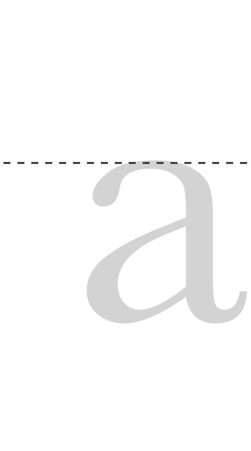
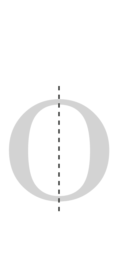
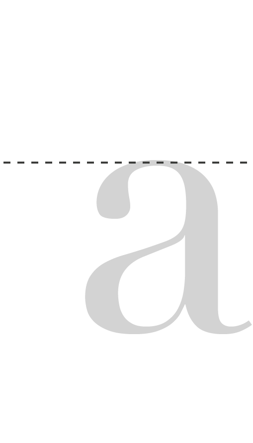
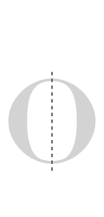
The Latin or Roman alphabet is a set of graphic signs based on the letters of the classical Latin alphabet and Greek. This is derived from a form of the Cumaean Greek version of the Greek alphabet used by the Etruscans.
It is the writing system originally used by the ancient Romans to write the Latin language. Due to its use in writing Germanic, Romance, and other languages first in Europe and then in other parts of the world and due to its use in Romanizing writing of other languages, it has become widespread globally.
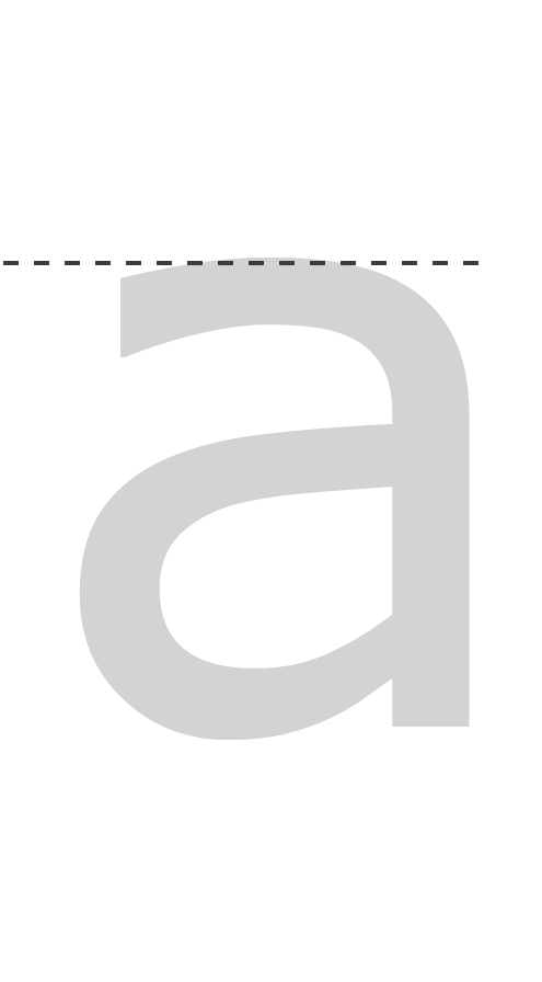
This is an 'A' from the Trajan typeface, which is based on the letter forms of 'capitalis monumentalis' or Roman square capitals used for the inscription at the base of Trajan's Column, from which the typeface takes its name.
In Renaissance Europe, the arrival of mechanical movable type printing introduced the era of mass communication, which permanently altered the structure of society. The relatively unrestricted circulation of information and (revolutionary) ideas transcended borders, captured the masses in the Reformation and threatened the power of political and religious authorities. The sharp increase in literacy broke the monopoly of the literate elite on education and learning and bolstered the emerging middle class.
The concept of adhering to manuscript models was the basis of the first 300 years of type design, and typefaces designed during this period are referred to as Old Style.
The typefaces of this period are called Transitional, as they represent the initial departure from centuries of Old Style tradition and immediately predate the Modern period.
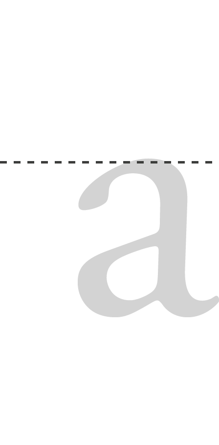
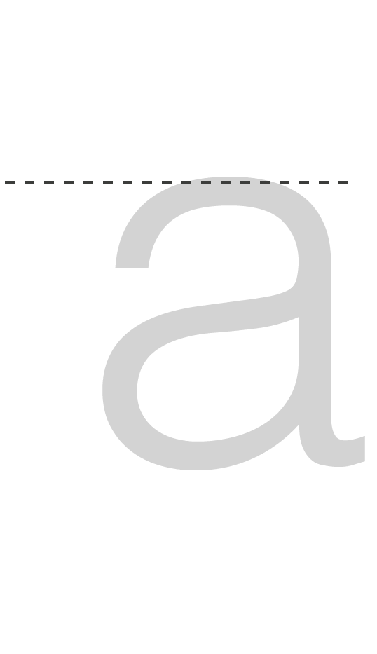
One of the chief influences of this period was English manufacturer John Baskerville, who, for most of his life, had nothing at all to do with printing or typography. He was a successful businessman in japanning, which was the decorating of metal articles with coats of varnish and paintings of floral and pastoral images. He was also a painter and a type designer. Named after its creator, this A belongs to one of the seminal transitional typefaces, Baskerville. Compared to earlier designs popular in Britain, Baskerville increased the contrast between thick and thin strokes, making the serifs sharper and more tapered, and shifted the axis of rounded letters to a more vertical position.[8] The curved strokes are more circular in shape, and the characters became more regular. Another highly notable figure from this period is William Caslon.
These types are classified as Modern because they represent the last phase of character evolution from the pen-inspired Old Style typefaces as well as the first effort to use the design of type to establish a contemporary visual style in typography.
Within a few decades, the wide acceptance of the Transitional types helped to inspire a new sense of typographic style in Europe, especially France and Italy. Typographers, inspired by Baskerville, further rejected the classic Old Style tradition of pen-inspired letters and continued to refine the notion of the perfect letterform.
The early 20th century saw continued technological advancement in printing and typesetting, flourishing of advertising and print journalism, and a contemporary movement in type design, influenced by the European Bauhaus and De Stijl design movements. For new generation of designers and typographers, the notion emerged of the typographic character as an expressive design element. Very much a backlash against the typographic excesses of the 19th century, the new design direction sought a basic letterform which was suitable for contemporary communication.
Arguably one of the most well-know typefaces, Helvetica is a neo-grotesque or realist design, one influenced by the famous 19th century typeface Akzidenz-Grotesk and other German and Swiss designs. Designed in 1957 by Max Miedinger with input from Eduard Hoffmann, its use became a hallmark of the International Typographic Style that emerged from the work of Swiss designers in the 1950s and 60s, becoming one of the most popular typefaces of the 20th century. Over the years, a wide range of variants have been released in different weights, widths and sizes, as well as matching designs for a range of non-Latin alphabets. Notable features of Helvetica as originally designed include a high x-height, the termination of strokes on horizontal or vertical lines and an unusually tight spacing between letters, which combine to give it a dense, compact appearance.
Web typography developed during the infancy of the World Wide Web. Due to the low resolution of early computers, new typefaces had to be developed to optimize legibility for reading on screens.
In the mid-1990s, type designer Matthew Carter developed to Georgia and Verdana, two widely used typefaces for screen-based media. Commissioned by Microsoft specifically for texts on web pages, both of these typefaces were designed first in bitmaps (to match the pixels of the screen resolutions at the time) and then translated into outline fonts. To make text legible and readable on screen, Carter had meticulously designed these fonts with large x-height, open aperture and generous space.
In addition to Georgia and Verdana, the web could only display system fonts such as Arial, Helvetica, and Times New Roman, which are available on all computers.